")

")
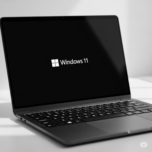
Microsoft announced radical changes to the design of the famous "Blue Screen of Death" (BSOD) in Windows. The iconic blue color is giving way to more modern solutions.
G. Ostrov
Microsoft is making the decision to abandon the traditional blue color of the Blue Screen of Death (BSOD), which has been an integral part of the Windows operating system for decades. These changes reflect the corporation's desire to modernize the user interface and improve the overall perception of system errors.
Evolution History of the Death Screen
The Blue Screen of Death first appeared in Windows 1.0 in 1985 and has since become a symbol of critical operating system errors. For many years, this screen remained virtually unchanged, maintaining its characteristic blue background with white text informing users about errors.
In recent years, Microsoft began experimenting with alternative color solutions. As part of the Windows Insider program, beta testers could already observe green variants of error screens, which became the first step away from the traditional color scheme.
Transition to Black Screen
The latest Windows builds demonstrate a radical transition to a black death screen. This decision is justified by several factors: improved information readability, compliance with modern interface design trends, and psychological impact on users.
Black color is perceived as less aggressive compared to bright blue, which may reduce user stress levels when critical errors occur. Additionally, the dark color scheme better integrates with Microsoft's overall modern design concept.
Technical Improvements
Besides changing the color, the new error screen received several functional improvements. Information about problems is now presented more structurally, with improved typography and expanded diagnostic data.
Users receive more detailed error codes and recommendations for their resolution. The ability to generate QR codes for quick solution searches in Microsoft's online knowledge base has also been added.
Impact on User Experience
Changing the death screen color may seem cosmetic, but it reflects deeper changes in Microsoft's approach to error handling. The company strives to make critical failures less frightening for ordinary users and more informative for technical specialists.
The new design also better matches the overall visual concept of Windows 11, where dark themes and minimalist solutions predominate. This creates a more cohesive perception of the operating system even during critical failures.
Community Reaction
The changes provoked mixed reactions in the user and IT specialist community. Part of the audience perceives abandoning the blue screen as a loss of Windows' historical heritage, while others welcome the modernization of this interface element.
Many administrators note practical advantages of the new design, especially improved readability of diagnostic information and more convenient structure of error data presentation.
Development Prospects
The transition to a black death screen is part of Microsoft's broader Windows modernization strategy. Future plans include further development of diagnostic and recovery systems, including integration with cloud services and capabilities for automatically resolving some types of errors.
These changes emphasize Microsoft's desire to create a more user-friendly and intuitive operating system where even critical errors become less stressful for users.
Additional information about new Windows features can be found on Microsoft's official website.
If you encounter any problems, contact us, we'll help quickly and professionally!